A NewPOS
Experience

A NewPOS
Experience

This was a big project with a lot of moving parts, and the case study is still a work in progress. There’s enough here to give you a sense of it, but it’s not the full story yet.
If you’re curious, I’d love to take you through it properly.


It's also best viewed on desktop currently - mobile is coming soon!

This was a big project with a lot of moving parts, and the case study is still a work in progress. There’s enough here to give you a sense of it, but it’s not the full story yet. If you’re curious, I’d love to take you through it properly.


It's also best viewed on desktop currently - mobile is coming soon!

THE CHALLENGE

A 20-year-old legacy POS relied on for 99% of transactions across 700+ stores with no design input, no analytics tooling, and a platform so constrained that minor UI changes took 12 - 18 months to ship.

What I did

Led end-to-end UX and product design across a multi-vendor, multi-region program: 12 store visits, 24 interviews, six archetypes, a north star and five design pillars, two shipped versions, and a design system built to work within hard platform constraints.

OUTCOMES

+28%

+28%

Task completion rate

-32%

-32%

Cognitive load (NASA TLX)

-46%

-46%

Error recovery time

3x

3x

Faster item identification

Or, keep reading to find out how I built a next gen POS on last-gen tech

Or, keep reading to find out how I built
a next-gen POS on last-gen tech

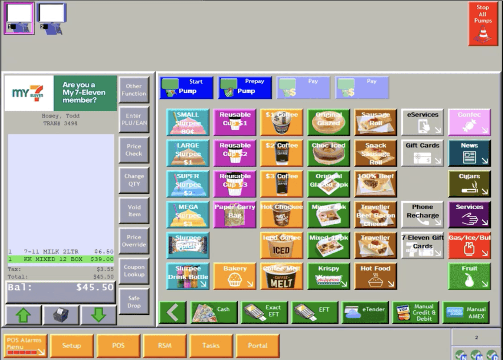
99% of transactions. Every second matters.

At 7-Eleven Australia, the POS handles 99% of in-store transactions, so every second at the counter matters. After more than 20 years on a dependable but heavily vendor-gated NCR platform, where even small enhancements could take 12–18 months to ship, the business transitioned to a new POS solution to unlock speed, flexibility, and long-term cost reduction.

As Experience Design Lead, I drove end-to-end UX and product design from research and synthesis through to prototyping, testing, and final delivery partnering across CX, service design, engineering, and solution architects across multiple regions around the globe.

Defining the right POS, not just a new one

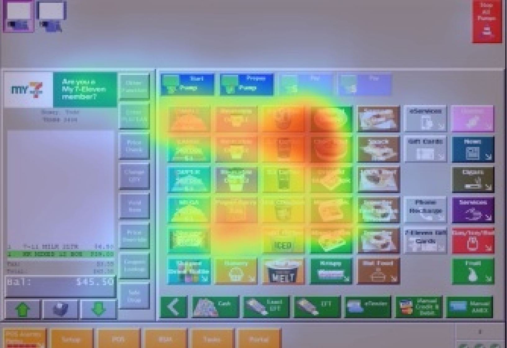
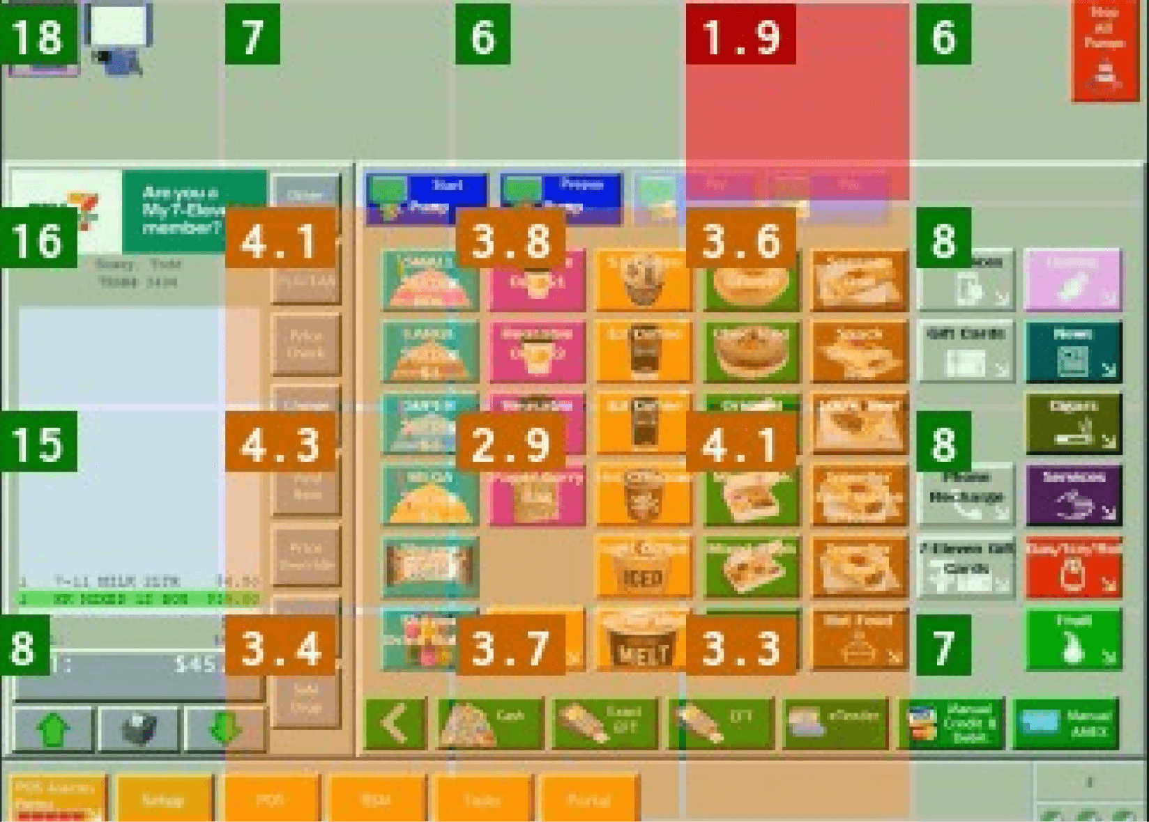
Before designing anything, I introduced a research-driven process to ensure every decision was grounded in real store behaviour, not assumptions. This combined store visits, service safaris, contextual interviews, observational shadowing, prototype testing, and video analysis using Attention Insight.

12

12

Store visits

24

24

Team members interviewed

16s

16s

Average transaction time

Some of the questions I asked included:

Some of the questions I asked included:

  • How do staff navigate high-pressure scenarios during peak periods?

  • Where do errors occur, and how are they currently resolved?

  • How do different roles (team members, managers, field staff) use the system differently?

  • What mental models have formed after 25 years with the legacy POS?

  • How might changes to workflows affect speed, accuracy, and confidence?

OldPOS - Hoo boy...

I used a tool called Attention Insight which helped inform early hypotheses, and validated what later interviews suggested: attention was concentrated in a small, dense area of the screen, and the surrounding UI was largely invisible to staff under load. We analysed core and edge use cases and defined a behavioral baseline for each major function.

Analysis: Not great… very 1998!

Analysis: Not great… very 1998!

OldPOS - Hoo boy...

I used a tool called Attention Insight which helped inform early hypotheses, and validated what later interviews suggested: attention was concentrated in a small, dense area of the screen, and the surrounding UI was largely invisible to staff under load. We analysed core and edge use cases and defined a behavioral baseline for each major function.

Redefining a new(?) order-of-operations

One of the early UX opportunities I identified was the order of operations staff would complete their flows in. From the existing POS, in a traditional left-to-right reading pattern, the transaction cart or basket was on the far left, the products in the center, categories scattered between them, and very little structure. One of the first things I did was re-architect and test the order-of operations.

The people behind (almost) every transaction

In-store visits surfaced something that research alone couldn't: the sheer cognitive load store staff were managing every shift. While spending up to 90% of their time at the POS, they were simultaneously expected to monitor as many as five separate devices, eCommerce orders, food and beverage temperatures, fuel forecourt activity, and more.

90%

90%

of shift spent behind POS

of shift spent
behind POS

5

5

devices to monitor simultaneously

Dozens of hours of interview and contextual interview video and audio.

Our in store teams were doing an incredible job, and managing incredible pressure, expectations, and more often that people realise, real danger.

First we define, then we design

First we define,
then we design

This product sits at the intersection of eCommerce interface patterns and traditional POS design - a genuinely hybrid retail environment that required careful UX strategy. I designed and led two versions across a complex stakeholder landscape spanning vendors, compliance teams, engineers, and partners across multiple regions.

CONSTRAINTS & PERSPECTIVE

This wasn't like a Square or Shopify implementation - platforms where modern UI is table stakes. The vendor platform runs enterprise-grade retail infrastructure across airlines, petrol stations, and supermarket chains globally. It's built for reliability and scale, not design flexibility. Every interaction runs through a sequential, form-based architecture. The constraints below aren't stylistic choices, they were the brief.

This wasn't like a Square or Shopify implementation - platforms where modern UI is table stakes. The vendor platform runs enterprise-grade retail infrastructure across airlines, petrol stations, and supermarket chains globally. It's built for reliability and scale, not design flexibility. Every interaction runs through a sequential, form-based architecture. The constraints below aren't stylistic choices, they were the brief.

Redefining an order-of-operations

One of the early UX opportunities I identified was the order of operations staff would complete their flows in. From the existing POS, in a traditional left-to-right reading pattern, the transaction cart or basket was on the far left, the products in the centre, categories scattered between them, and very little structure. One of the first things I did was re-architect and test the order-of operations.

1

Product category

What type of item am I searching for?

2

Product hotkey

I’m looking for the item by image and colour first

Feedback, function & controls

Do I need to edit, or apply anything to this before we proceed?

3

Basket & totals

Is this correct? Is the customer ready to pay?

4

Product category

What type of item am I searching for?

1

Product

hotkey

I’m looking for the item by image and colour first, text description second for confirmation

2

Feedback, function
& controls

Do I need to edit, or apply anything to this before or while in basket?

3

Basket & totals

Is this correct?
Is the customer ready to pay?

4

This formed the basis of the core transaction flow - separate to fuel and other "live activities" I defined a key merch-sale and process flow based on software and analysis from over 75,000 eye tracking data points.

Selling screen, or "Home" screen for 90%of a shift

Selling screen, or "Home" screen for
90% of a shift

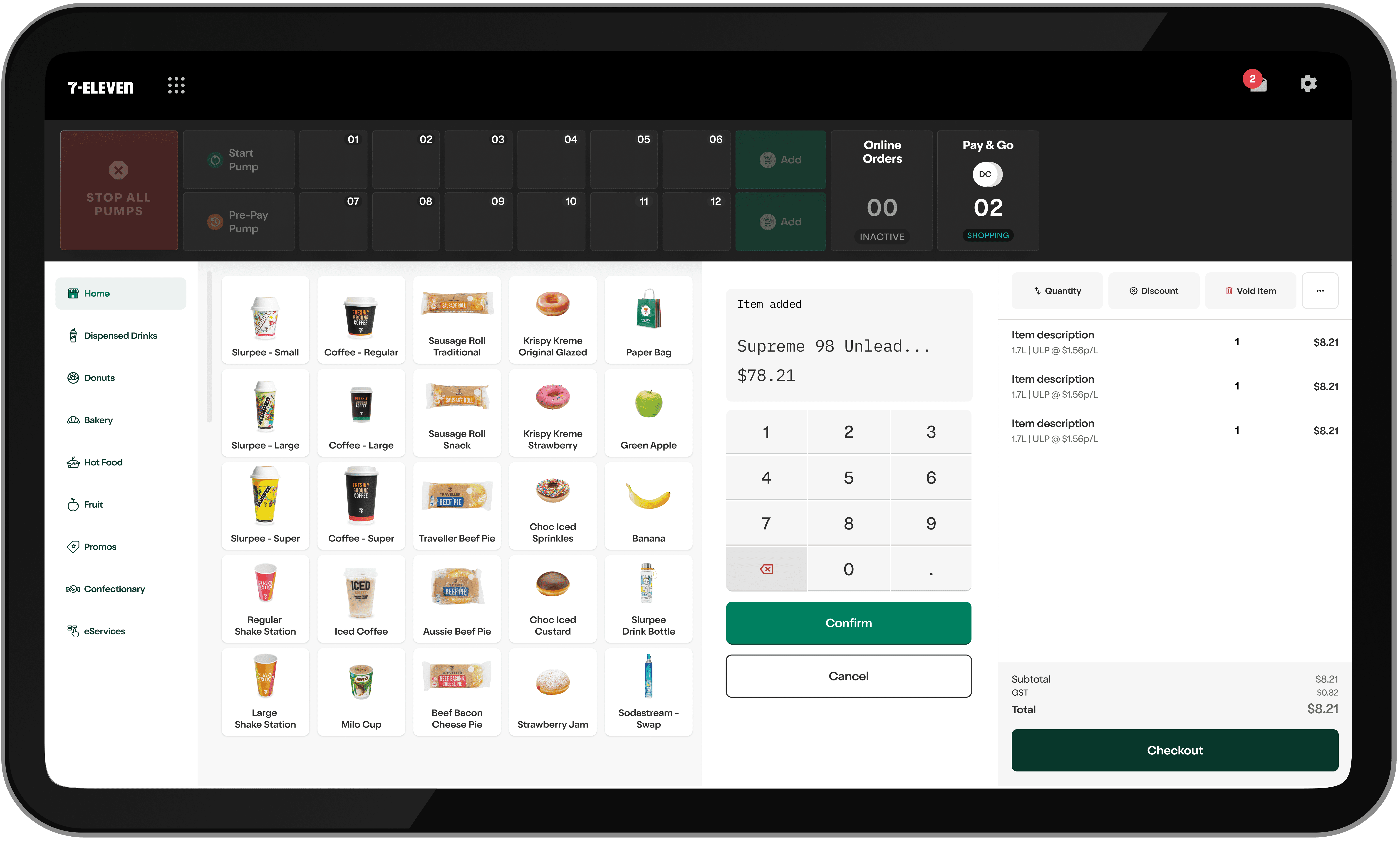
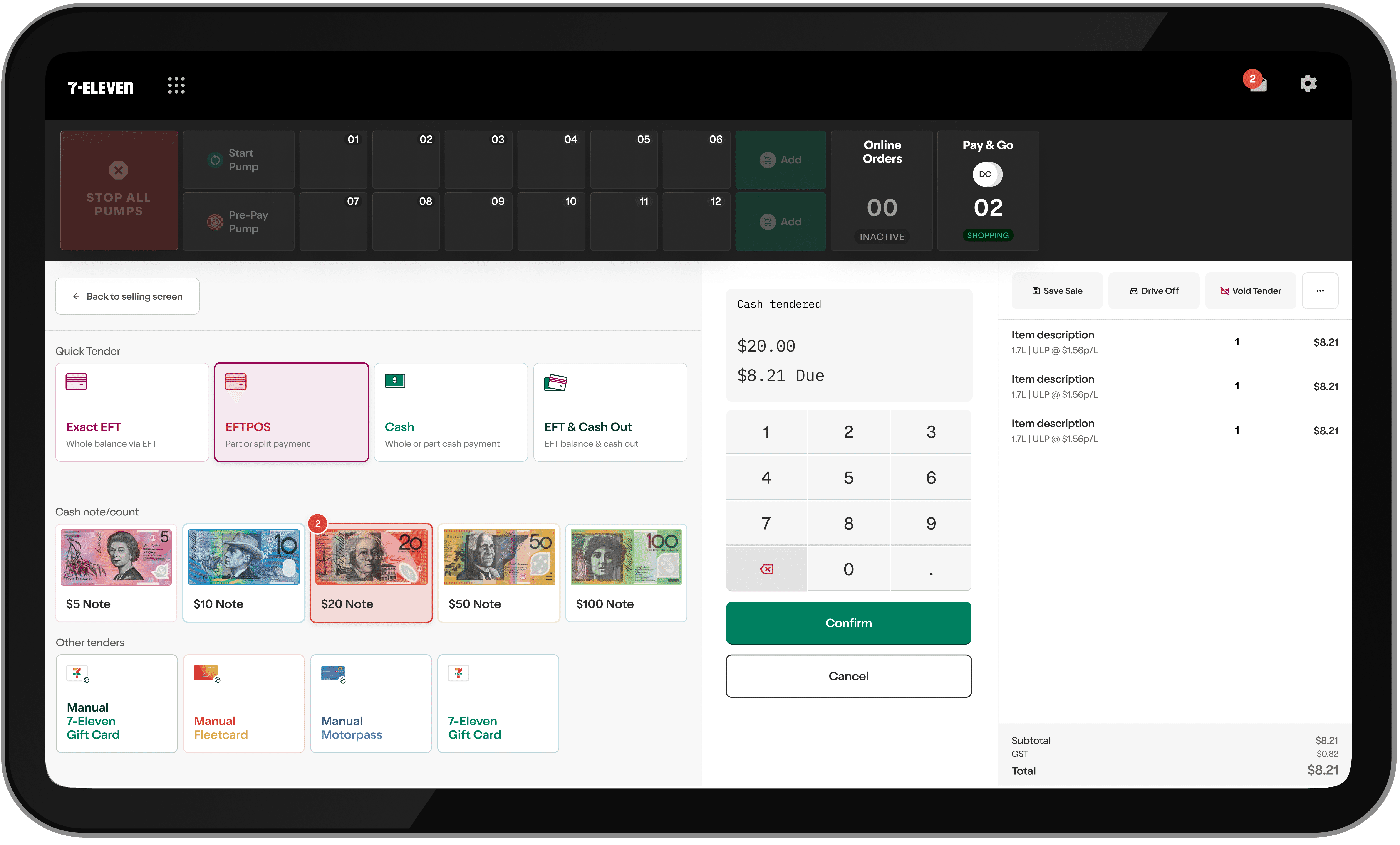
The new Payment screen

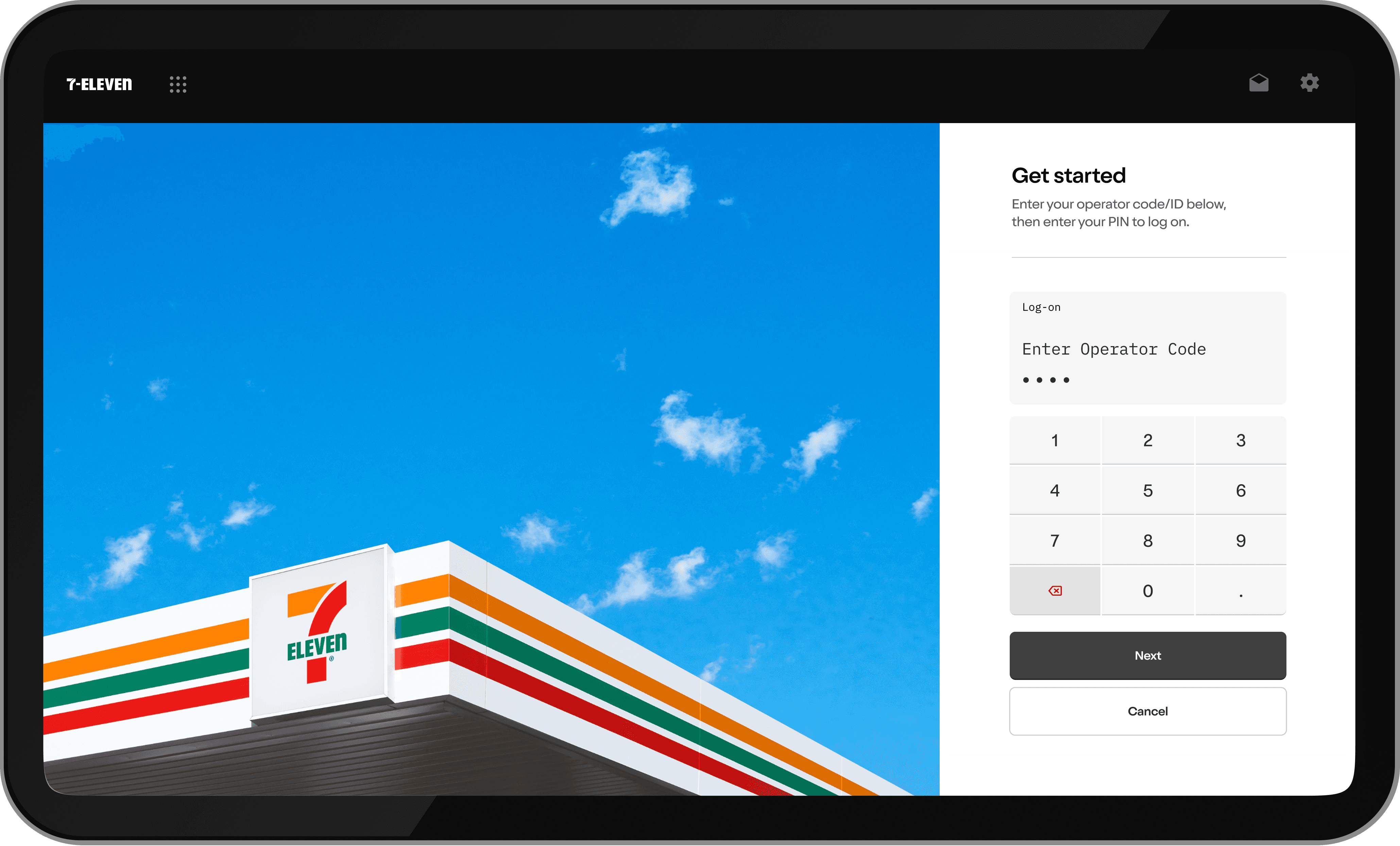
A fresh log-on experience

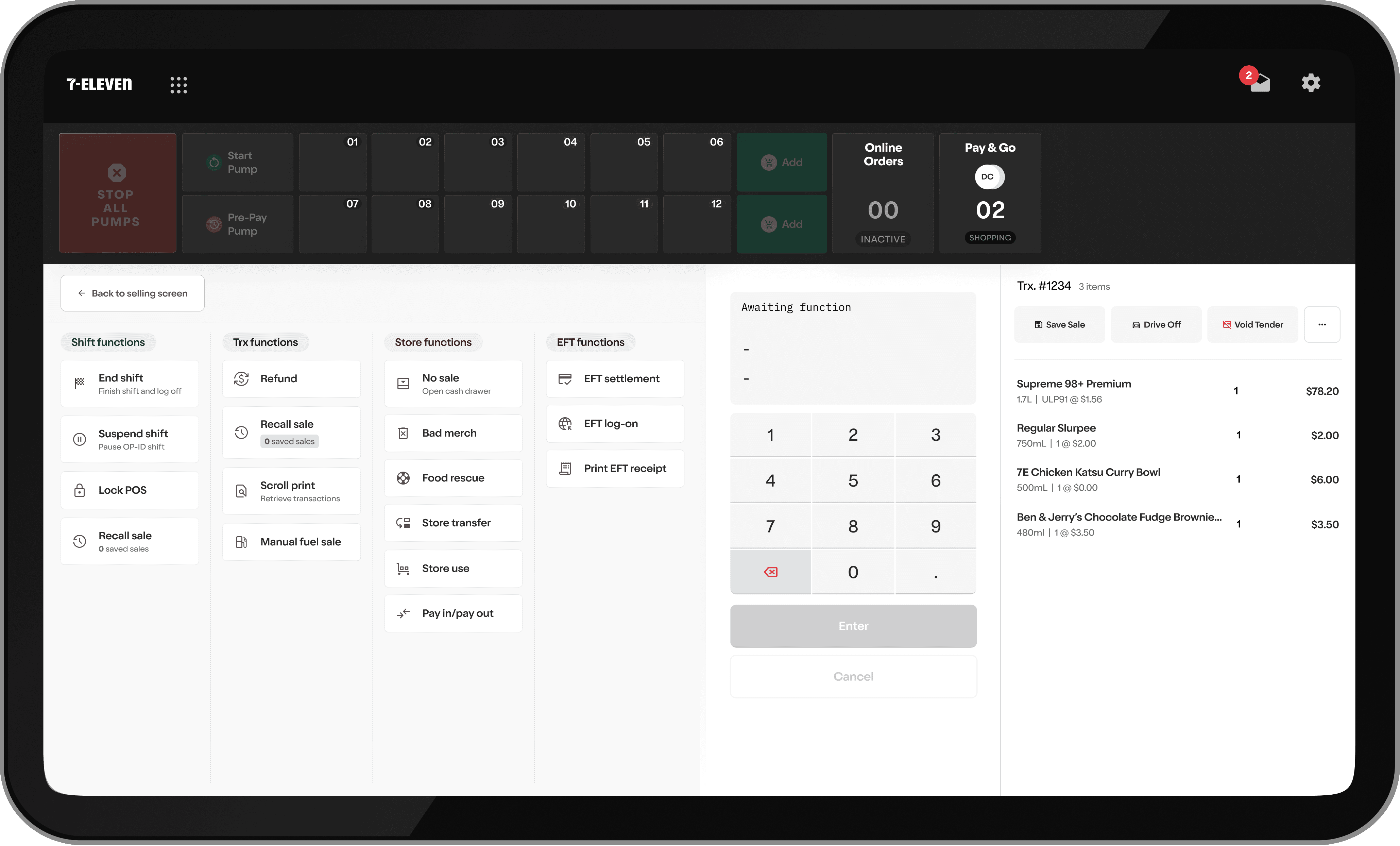
Functions grouped by category and role

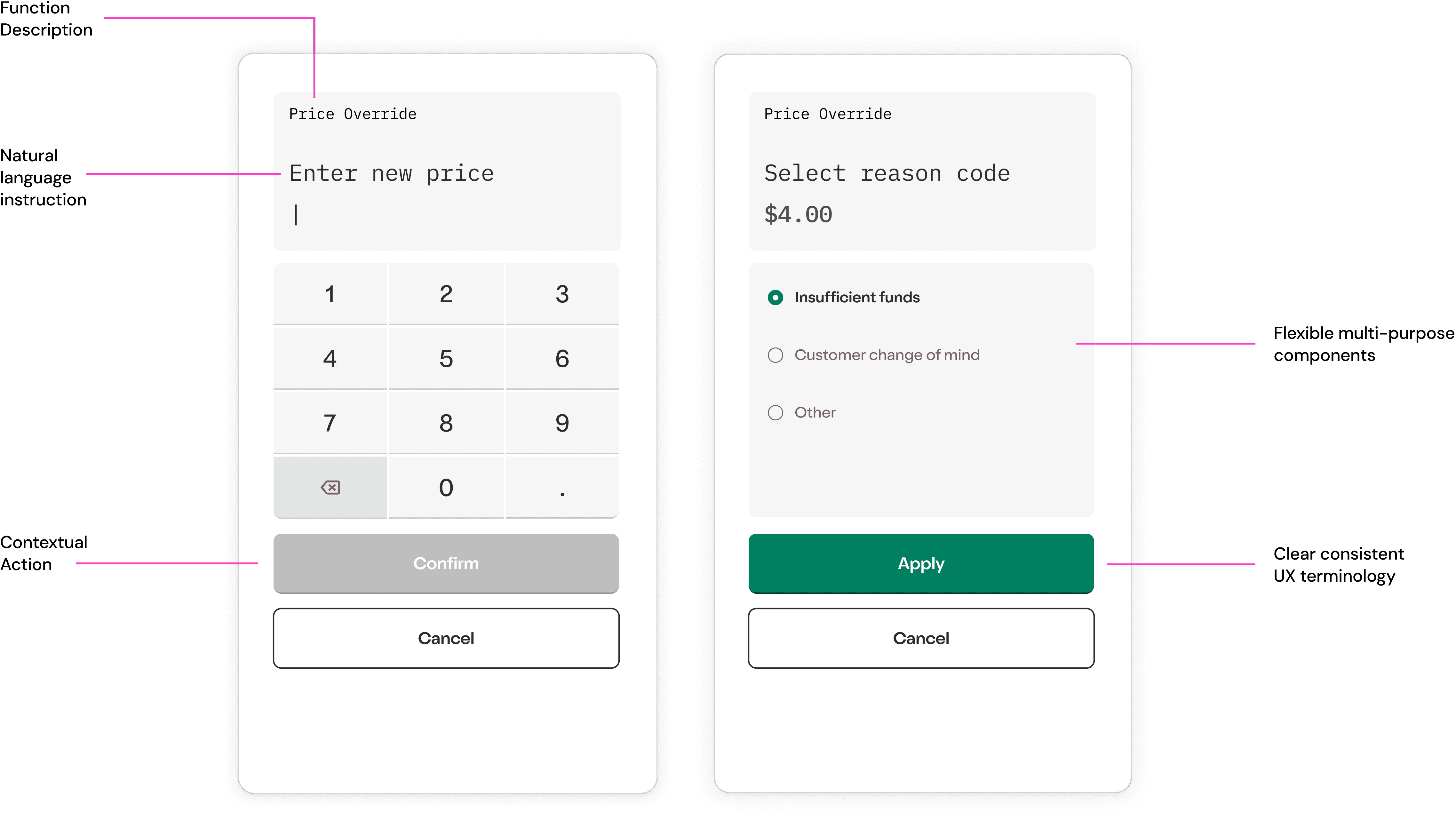
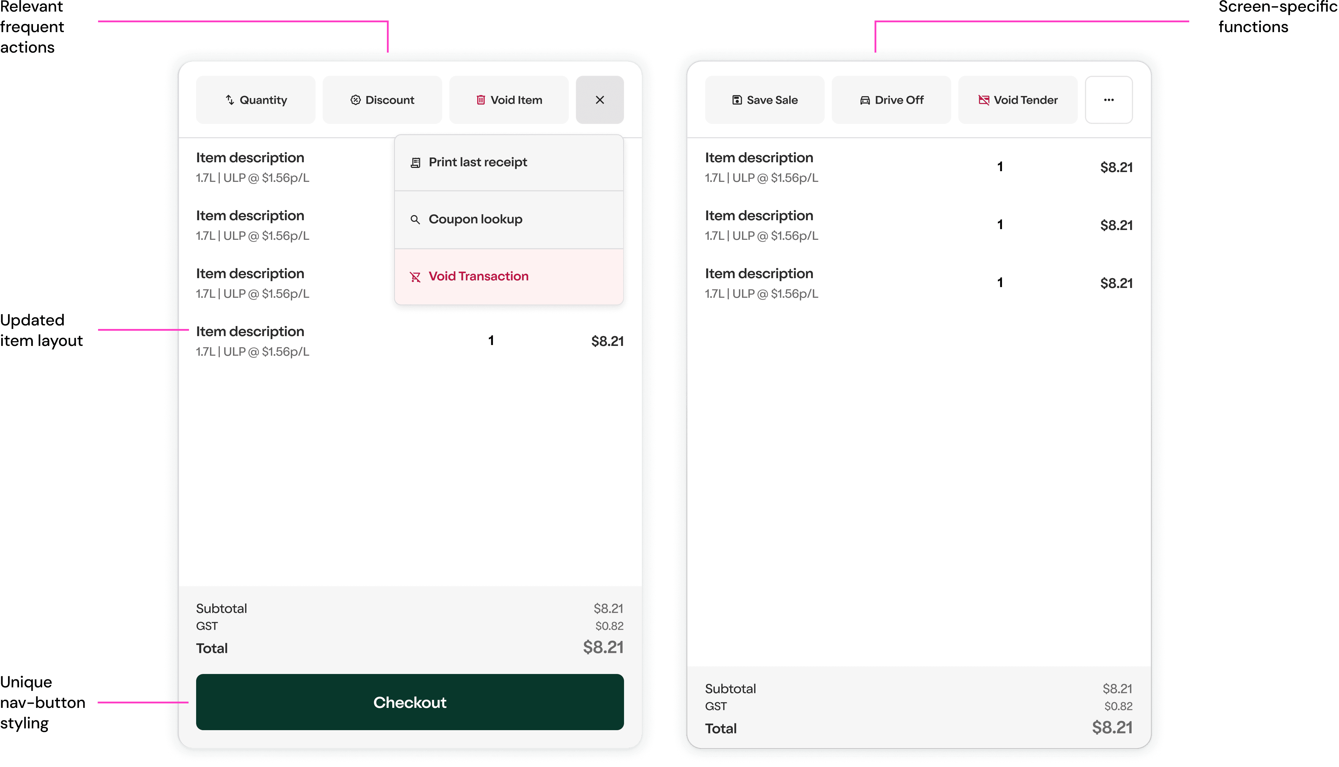
Meaningful improvements
within real-world constraints

Redesigning the 7-Eleven POS was one of the most complex and rewarding challenges of my career. Rather than a purely aesthetic redesign, the focus was on making everyday tasks clearer, faster, and more reliable for the people who depend on them most. Post-pilot usability testing showed measurable gains across the core transaction experience.

+28%

+28%

Task completion rate

-32%

-32%

Cognitive load reduction (NASA-TLX)

-46%

-46%

Error recovery time

What the work actually required

What the work
actually required

The most interesting thing about this project was the reminder that a system can be deeply familiar and still deeply frustrating.

Store staff had spent years developing workarounds for an interface that demanded more than it gave them. The work wasn't about teaching them a new system. It was about building one that worked the way they already thought - that trusted their expertise, respected their time pressure, and got out of their way.

Designing under the constraints of WinFORMS forced a kind of creative discipline I've come to value. Every pixel and every word had to earn its place. There was no room for decoration. That's a good way to design anything.

More screens and information coming soon.

More screens
and information
coming soon.